Summer 2026: On the Body
Our summer issue—On the Body—is now available! Featuring poetry, fiction, and nonfiction on body image, health, beauty, biology, hearts, heartbreak, and more, this issue includes work by Ifeona Fulani, Kimberly Ann Priest, Danielle Boodoo-Fortuné, Rochelle Hurt, Jordan Bolden Majewski, and Dante Di Stefano, among others.

Read our editor in chief Timothy Schaffert’s introduction to the issue and cover art below. Visit the current issue page to see the full table of contents and read excerpts. Want to order the issue? Head over to our online store.
On the Body
by Timothy Schaffert
In among ads for scouring pads and cigarettes, for brassieres and pasteurized prunes and cures for “infectious dandruff,” headlines in the 1947 issues of Woman’s Home Companion posed questions: “What Do You Think of Birth Control?” “What Do You Do About Cancer?” “What Do You Know About Hair?” “What Makes Children Fat?” “Should Anybody Be Sterilized?” In one headline, the US surgeon general pronounced “We Could Banish V.D. in Nine Days.”
But before all those articles, at the very front of every issue, were typically five or six pieces of short fiction, each accompanied by full-page, full-color artwork created specifically for the stories. For the front and back covers of this issue of Prairie Schooner, our designer, Ashley Muehlbauer, has fashioned a collage in tribute to the lush illustrations and domestic disquiet at the heart of midcentury monthlies; this issue’s theme reflects something of the preoccupations of women’s magazines of the era. [The illustration on our cover, by Ward Brackett, originally ran in the November 1947 issue of Woman’s Home Companion with “Love Is a Dirty Trick” by Charlotte Edwards. Here’s the moment depicted: Peggy’s hair was spread on a white towel. The sun caught it and turned it deeply gold. Her straight little nose pointed up to heaven. The ripe red of her mouth was relaxed and loose, like a child’s. Her sun suit, what there was of it, was yellow as a buttercup.]
Writers and artists could make a good living off the monthlies and have the pleasure of seeing their work mass-circulated and splayed out so extravagantly (on pages of 10-by-13¼ inches), but they also faced some upturned noses. Though the magazines might feature notable authors such as Edith Wharton, Dawn Powell, Patricia Highsmith, Kay Boyle, and John Steinbeck (Woman’s Home Companion published his novella “The Pearl” in full), there was some presumption of pandering among the magazines’ regular contributors.
In an essay in the Spring 1940 issue of Prairie Schooner, a writer named Robert Whitehand elevates the content of literary journals by belittling the fiction in popular magazines. He quotes an unnamed associate editor at one of “our beautifully printed periodicals” on the subject of the “grooved formula demanded by many magazines”:
“Once a month,” she says, “we get together to write the blurbs. That’s the day when everyone is grouchy. We chew our pencils, our fingernails, and even the inkwells if the office-boy forgot to hide them that morning. Our nerves are ragged by noon. But sometime we’re going to write what we really think of that tripe we publish, and it’ll run something like this: This is another godawful story, but maybe you dopes will like it. . . . Here’s the same story Arthur Royal has been selling for years—he just changed the names of his characters again. . . . If you have a vocabulary of five hundred words this story won’t come up to your intelligence. And she added: “It’s a wonder we don’t go nuts.”
Our theme for this issue came together long before the design concept for the cover, and it emerged from the submissions themselves, based on the shared ideas and expressions of the authors. I make short notes on the pieces I accept for Prairie Schooner, and terms such as biology, body image, birth, death, well-being began to come together in one central concept: on the body.
Body horror has been much the topic of pop-culture conversation, and some of the short stories we received leaned tantalizingly in that direction: dystopian visions of physical threat/theft, whether set in the nineteenth century (“Disinterred—Edinburgh 1863,” about a body-snatching medical student) or a future informed by a present-day foreboding (“Ten Forbidden Words,” on government censorship, and “Model Woman,” on serving the insatiable rich).
And while the other pieces in this issue might make a passing glance at horror, most of them contemplate our daily maneuvers, our dances and our distortions, as we negotiate our space in the world, our physical presence, our health, our autonomy. The climate, and our relationship with nature and other animals, informs some of the work here too, with poems such as “Yearling” (Beauty of lupine, lily, wild rose, bedstraw, and violet / yielding to his hoof. Which among them did he / sleep and dream in?), “Instructions on Becoming a Bird” (if you swallow a swallow / you will become heavy inside), “Self-Portrait as Thermophile” (I mourn / chartreuse verses, Bible / with an arsenic spine, / petrified tree ringed white), and “On Killing a Bee at Naples Pier, Florida” (I held a new / power I didn’t know what to do / with, I held a curved shell against / your legs like a ramp, but you couldn’t / hoist your weight.)
For my first approach to a cover concept, I dug up some images of plastic dolls stripped naked, their hair ratty, but that was before I went looking for something to feature in our “On the Archive” section. I discovered a short story from the spring 1930 issue of Prairie Schooner, “East Sound Girl,” and its now-obscure author, Mary Brinker Post, who went on to a career as a contributor to, and editor of, midcentury women’s magazines. (She’s now better known from murder podcasts; see my essay in this issue, “She Married a Serial Killer.”)
And in an eerie coincidence, at around the same time that I was searching for Post’s fiction, I received an invitation to pick up some bound editions of old periodicals deaccessed from a local library’s collection: I therefore came to have several years of Woman’s Home Companion, Ladies Home Journal, Delineator, Collier’s, and other magazines from this golden era.
The back cover of this issue includes work by illustrator Walter Baumhofer, for “The Important Hour” by Faith Baldwin, also from Woman’s Home Companion. (The “blurb,” to use the term employed by the unnamed monthly editor referenced earlier, reads: “You haven’t changed at all” can be a compliment—or the most devastating truth a woman can learn about herself.)
Both artists in our collage had successful careers illustrating magazine fiction until the work began to dry up in the 1960s (magazines’ abandonment of fiction is sometimes attributed to the development of television), at which point they turned to fine art, selling their paintings in galleries. Brackett and Baumhofer were each married to artists successful in their own right: Dolli Tingle and Alureda (Rita) Leach, respectively.
In addition to contributing to women’s magazines, Brackett illustrated a number of US postage stamps, including one issued on the occasion of the fiftieth anniversary of women’s suffrage, as well as at least one Esquire magazine calendar of pinup girls. He temporarily paused his magazine work in the 1940s to contribute to the war effort, preparing instructional posters. Baumhofer, meanwhile, supplemented his magazine work with cover art for crime novels and detective magazines, earning him the sobriquet “King of the Pulps.” The Dowd Illustration Archive of Washington University Libraries holds the Walter Baumhofer Collection, which includes his publications and originals.
We’ll continue to publish work on the topic of the body, I’m certain, and it’s not the first time Prairie Schooner has devoted a special issue to such considerations: visit our archive on JSTOR for the Summer 1999 issue titled “Disruptions,” edited by Hilda Raz, and Project MUSE for Kwame Dawes’s Winter 2015 issue devoted to sports, guest-edited by Natalie Diaz. Now, nonetheless, feels like a historical moment, informed by new cures and new disease, by social media influence and its perpetual peer pressure, by legal interference, climate collapse, love affairs with disembodied chatbots.
Our bodies are caught at the nexus of pleasure and fear, of independence and captivity. The artist has always turned more deeply inward in the face of alienation.
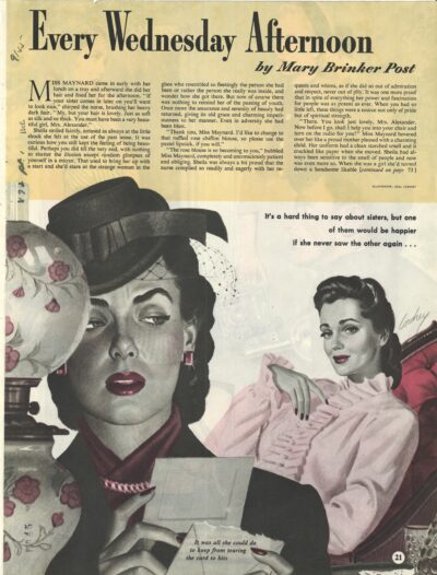
Image Caption: The first page of Mary Brinker Post’s short story, “Every Wednesday Afternoon,” in the January 1945 issue of Woman’s Home Companion, illustrated by Earl Cordrey.